Not everyone can translate a verbal message through visuals—but EVR’s Senior Graphic Designer Keith Kryzak sure can. And he does so in a way that evokes emotion and passion for brands just like yours. Keith has been helping clients find creative solutions through a wide variety of channels for more than a decade. He has a knack for helping clients meet their business goals by elevating their visual communication, from concept through delivery.
Design trends typically have a lifespan ranging from one to five years, while macro trends can endure for five to ten years. These broader trends often reflect societal perspectives and can be influenced by various factors, including nostalgia (who doesn’t love a ’90s comeback?), pop culture, trending themes and more. In the following section, Keith will walk us through some of the design trends he knows and loves.
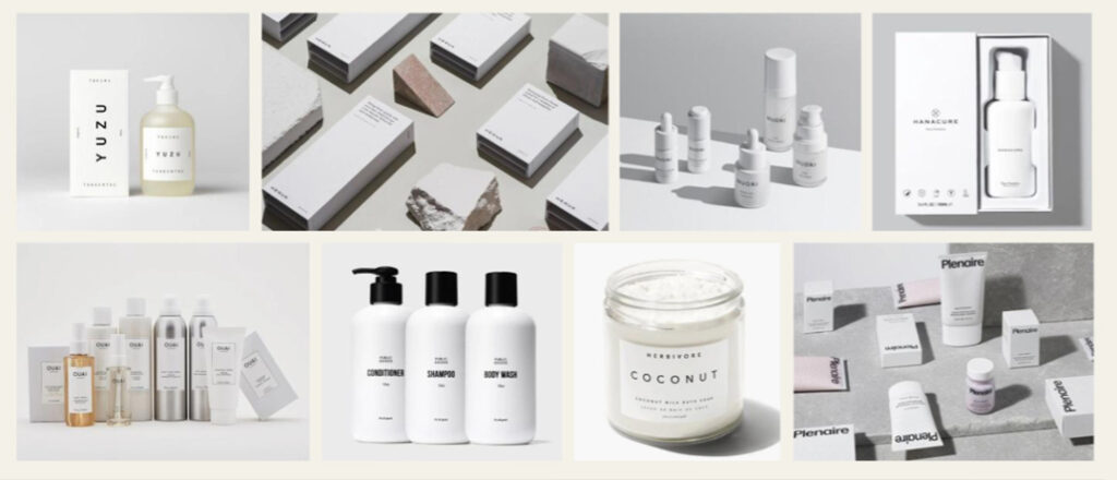
1. Minimalism
“Less is more,” they say and that’s the essence of minimalistic design. We strip away unnecessary frills and focus solely on what’s essential. Maximalism is making a comeback with its bold colors, fonts, patterns and textures. At EVR, we know context is key and we prioritize strategic design. That’s why we adopt a minimalistic approach with our clients in the senior living space, manufacturing and even our own brand.
2. Retro
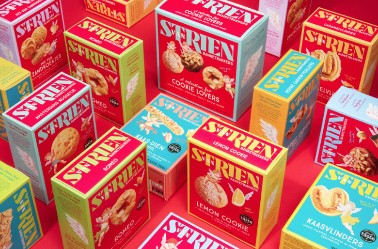
The ‘90s are back baby and we’re here for it! Seriously, they’re even selling ‘90s Halloween costumes now. But here’s the thing: trends from any era can resurface in your lifetime because nothing tugs at the heartstrings like nostalgia. The retro design trend, with its fresh take on the familiar, is gaining popularity for a reason. From freeform typography to bold colors and even a dash of cyberpunk vibes, major brands like Nike, Pepsi and Gucci have found success in blending the old with the new in their advertising. At EVR, we’ve witnessed the power of retro design in our direct mail for a Kentucky Derby event for a senior living client and in crafting logos for a catering company.
3. Blurs and Gradients
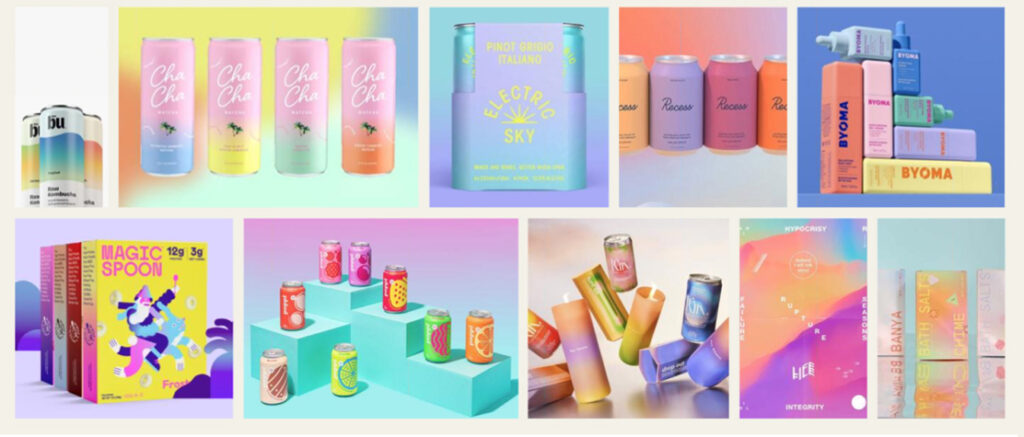
Gradients aren’t new—they’ve been around since the dawn of time (okay, that may be a bit hyperbolic, but you get the picture). Graphic designers are finding new spins on this old trend that make it pop even more. Why do they work? Blurs and gradients can bring focus forward to a single element of your work, especially when it relates to text overlays. Plus, if you want to play around with a color scheme, you can do so without feeling too over the top. At EVR, we use gradients for our energy efficiency clients to make their logo pop on printed pieces.
4. Motion Graphic
When it comes to eye-catching design, animation has a leg up over static elements. That’s because movement naturally draws your eye to certain aspects of visuals and allows you to highlight multiple aspects simultaneously. Even better? It can help boost engagements with your content. At EVR, we use motion graphics for all of our clients in some capacity, be it through social media animations, animated banner ads, YouTube videos or more.

5. Maximalism
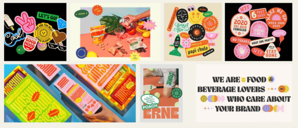
Minimalism’s boisterous cousin maximalism is resurfacing. This design trend draws inspiration from Andy Warhol’s pop art, as well as from art nouveau and surrealism. This type of design often features collage-like elements in addition to bold colors, patterns and textures to create visually striking elements with depth that create interest. While we haven’t fully embraced maximalism at EVR, our design philosophy is rooted in strategy. So far, it hasn’t called for maximalism. Nevertheless, we remain open to new possibilities because, as they say, never say never.
6. Bonus: Design by AI
While still in its infancy, AI tools are revolutionizing the world of design. While AI isn’t set to replace human creativity anytime soon, it’s proving invaluable for generating creative ideation and visualizations. How does it work? Imagine text-to-image generators, recreations of buildings and “hand”-drawn illustrations.
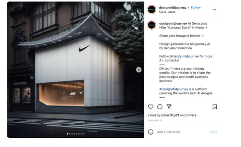
Image source from looka.com, oddesignstudio.nl, @designmidjourney, graphicartstoday.com, email.uplers.com
