
New Hampshire | Brand Awareness
Granite State Children’s Alliance (GSCA)
Overview
The Granite State Children’s Alliance (GSCA) is New Hampshire’s statewide network of Child Advocacy Centers (CACs), providing coordinated support for child victims of abuse and neglect. As the only agency of its kind in the state, GSCA sought to strengthen brand cohesion across nine CACs, elevate awareness of its flagship program KNOW & TELL® and more clearly communicate its mission of delivering justice, healing and hope to children and families.

Challenge/Objective
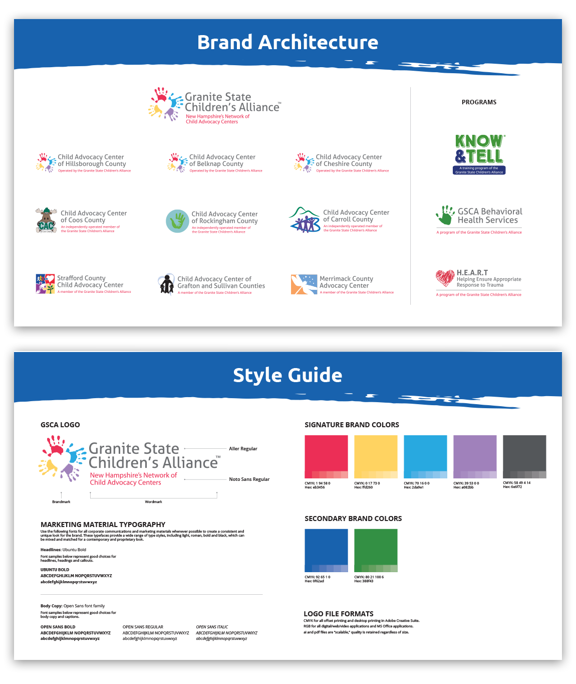
GSCA faced brand fragmentation and public confusion—often being mistaken for other organizations like CASA (Court Appointed Special Advocate) or DCYF (Division for Children, Youth and Families). Each CAC had its own logo, tone and messaging, making it difficult to present a unified front. The objective was to create a cohesive brand architecture and messaging platform that would:
- Clarify the relationship between GSCA, CACs and programs like KNOW & TELL.
- Align the visual identity and storytelling across all CACs.
- Establish consistent messaging that is hopeful, not heavy and easily understood by donors, partners, legislators and families.
Strategy
EVR developed a comprehensive brand platform designed to unify GSCA and the statewide CAC network under a single, adaptable brand system. Through discovery and intake sessions, stakeholder interviews and a marketing audit, EVR identified opportunities to simplify communication and build equity around the GSCA name.
Key strategic pillars included:
- Define the brand hierarchy to clearly position GSCA as the parent organization and CACs as local extensions.
- Craft a compelling brand story rooted in justice, healing and hope.
- Integrate all GSCA programs—including KNOW & TELL and Behavioral Health Services—under one cohesive messaging and visual framework to reinforce organizational unity and strengthen overall awareness.
- Empower internal and external audiences with clear, emotionally intelligent messaging that avoids stigma and fosters trust.
- Differentiate GSCA through tone and language that emphasizes empowerment and collaboration rather than crisis.
Tactics
Our approach included:
- Brand Architecture & Identity System: Developed an adaptive branded house, linking GSCA and CACs with shared visual and verbal identity standards. This included the creation of updated logos and lockups and establishing consistent color, typography and design elements that visually connected each center to the GSCA parent brand.
- Messaging Framework: Created messaging by audience—board, staff, partners, donors, families and children—anchored in the brand promise: “We deliver justice, healing and essential skills to navigate trauma, empowering children to step into the future they deserve.”
- Comprehensive Style Guide: Established consistent typography, color palette and tone guidelines.
- Communications Toolkit: Provided plug-and-play materials for all CACs, including logo lockups, social media templates and key phrases, such as, “Kids are counting on us.”
- Annual Summit Presentation: Shared the new brand platform—including messaging framework and architecture—at GSCA’s Annual Summit Meeting to align CAC teams on the unified direction and demonstrate how the updated materials can be applied across communications.

Results
The project created a clear, unified identity that strengthened GSCA’s statewide presence and improved consistency across all nine CACs. The new brand framework and messaging toolkit enabled every center to confidently communicate GSCA’s mission and value with a shared voice—building recognition, credibility and community engagement.